There are many approaches to asset allocation and I will try to give them all justice in turn. However, as promised, I will unveil one approach that I worked on for several months designed to pull off a difficult task: Picking the precise moments to shift in and out of stocks.
The model relies on three basic indicators:
1. The spread between earnings yield on the S&P 500 Index and the yield on 10-year Treasury Bonds
2. The spread between 10-year Treasury Bond rates and 90-day T-bills (one measure of the slope of the yield curve)
3. The spread between AAA rated corporate bonds and 10-year Treasury Bonds
For the uninitiated, earnings yield is calculated in the following way for an individual stock:
(1/PE ratio)*100% = earnings yield
For example on a 25 PE: (1/25)*100% = 4% earnings yield
The basic logic for each indicator being included is as follows:
1. The earnings yield spread is a measure of the relative valuation between stocks and bonds. A wide spread indicates that stocks are undervalued while an inverted spread indicates that stocks are overvalued.
2. The yield curve measurement relies on the predictive power of the Treasury yield curve for predicting major economic cycles. A heavily upwardly sloped yield curve indicates that the market expects short rates to rise in the near term because economic growth, and therefore inflation expectations, will be rising. An inverted yield curve indicates the opposite.
3. The corporate credit spread measurement is a proxy for financial panic and complacency. A wide spread indicates that markets are skittish and investors will only buy corporate bonds at severe discounts to Treasuries. A narrow spread indicates the opposite. This is a contrarian indicator. It is specified to give favorable signals when things look frightening for corporate credit.
Without getting into too many specifics at this point, the model relies on a composite score of the three indicators to give signals of when to re-balance your portfolio. The more favorable the composite becomes, the more you should shift into stocks. The more it indicates unfavorable conditions the more you should shift into bonds. Fairly simple, though the calculations were a pain.
The model has upper and lower bounds for asset allocation of 80% and 20% meaning that neither stocks or bonds can ever be less than 20% of your portfolio. I may respecify this to allow for 100% allocations, but I am not sold on that idea yet.
Here's a chart of how one specification of this model allocates:
It may look very volatile, but bear in mind this is over 57 years and it is crunched into a single graph.
Now, the fundamental question is: How does this work in practice? Does it provide a high rate of return with high rates of stability?
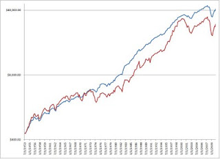
Well, historically back tested it produces a compounded annual growth rate of 8.0% vs 7.0% for an all-stock portfolio over the same period. More importantly, it does this with a lower range of volatility. The annual standard deviation for returns is 8.6% for the model and 15.3% for an all stock portfolio. Graphically, it looks something like this (red line is all stocks, blue line is the model under the specification above):
The graph is in logarithmic terms because it provides a more accurate picture. As you can see, the model is still prone to some losses in severe market downturns, but on the whole it is more stable.
One challenge of the model is that it is subject to long periods of under-performance like any balanced portfolio. The trick to the model is that it makes up a lot of ground in bear markets because it correctly moves investors into a bond-heavy position just before major declines. It does move back into stocks too soon in 2008, but it does have investors fully invested at the bottom and in for the subsequent rally. In the bear markets of 2000-2002, 1990, 1981-82, and 1973-74 it performs very well indeed.
Of course, the future might not look anything like the past, but I think such an approach is promising.
What do you all think?
Btw, the model currently suggests an 80-20 stock/bond split.


I strongly recommend (maybe beg?) that you make your awesome excel sheet into a google doc that can be shared amongst us.
ReplyDeleteAs for the actual idea of asset allocation, this is definitely what I want to do in the future, I'm tired of the volatility of individual stocks (plus, why spend so much more time analyzing individual stocks if I can do just as well with much less work).
ReplyDeleteI actually made an attempt at converting it to a Google Docs sheet, but some of my formulas broke. I need to try again. I will eventually actually tie about 80% of my own assets to this strategy. I will use individual stocks for specific purposes (ie playing Brazil, Turkey, or whatever), but for my big chunk of money, this will be it.
ReplyDelete