Disclaimer

Opinions and observations expressed on this blog reflect the authors' individual experiences and should not be construed to be financial advice. None of the members of this blog are licensed financial advisors. Please consult your own licensed financial advisor if you wish to act on any recommendations here.

Monday, May 30, 2011

Oil's Fair Market Value

This is a popular thread of conversation lately, and I've seen a few things that have piqued my interest in the subject of late.

One is this Marketwatch article that discusses the changing "break-even" price of oil in recent years. Basically, it's not so simple as just the mechanical break-even price of production, which is comparatively low in the OPEC countries almost uniformly (often sub $25 a barrel). It is a question of how much of a profit do they need to turn on their oil in order to satisfy growing political demands at home. According to the article, though this is difficult to verify, that price has increased from $30 a barrel to almost $85 since 2003.

I suspect a good portion of that might be quite recent as a consequence of the uprisings in the nations of the Arabian Peninsula and North Africa. Governments across the Middle East, especially Kuwait and Saudi Arabia, have opened up the fiscal spigots to quell the hot tempers of their simmering people, tired of corrupt and unresponsive governments that also do not reflect their religious values. To be sure, there is a split between more secular reformers and the religious fanatics in their motivations for reform, but the point remains that there is deep dissatisfaction and there should be, to be perfectly honest.

Atop this is the simple factor that supplies from Libya have been badly disrupted by the ongoing civil war there where one of the principal battlegrounds has been near one of the major oil distribution terminals. As oil's supply and demand curves are both highly inelastic in the short-term, that magnitude of disruption is difficult to discount. Similarly, oil traders have generally assigned a security premium of indeterminate value to the price of oil for fear of major disruptions.

The other major factor has been a recent/ongoing rout of the U.S. dollar versus virtually all currencies. However, this is a comparatively modest contributor and we can determine what that effect should be by simple arithmetic.

Working against oil is the fundamental fact that world stockpiles are sitting quite pretty at the moment.


U.S. stockpiles (Source: Energy Information Agency) are at very high levels indeed and the OECD as a whole is at the high-ish end of its range in terms of days of supply. Further, as consumption buckles and new production appears more attractive at current prices, the self-corrective mechanism of inventory builds is likely to take hold. However, I would caution against people who look at the current days of supply in oil and say, "Well, golly, why don't we have $30 a barrel oil again.". Things have changed since those old days and the world's oil supply has become fundamentally more difficult to get at and with it production costs have legitimately risen considerably. Cheap oil is simply no longer a possibility. What's more is that current markets are discounting the not too distant future in terms of both rising demand and more constricted supplies. 

Still, there is plenty of evidence that there is some intangible valuation going on with oil. A few weeks back, the price broke by nearly $10 in a single day. Healthy markets simply don't do that. I would struggle to tell you what oil's fair market value actually is, but I suspect that it is presently overvalued by 10-15%. I would not stake my life on such a bet, nor would I make a play like I did with options on silver. That was a clear cut bubble that could not be justified. This, on the other hand, is considerably more cryptic. 

Stay tuned. 

Saturday, May 28, 2011

Do Economic Growth Incentives Pay For Themselves?

As someone who works in public finance, I often get asked outside of my job a number of questions similar to the title of this post. Recently, I negatively commented on tax incentives given out by the state of Kentucky to build a young-earth creationist theme park. I had two basic objections. One was that I thought it promoted an unscientific view of the world, which is ironic since the state spends so much money attempting to property educate its young people in the public school system in the ways of science. The other is another point, which is the primary focus of this discussion, centering on whether or not this use of tax incentives is appropriate from a public finance perspective. Advocates of these sorts of projects almost invariably say, "Oh, but it will pay for itself.". Republicans do the same thing with tax cuts more generally while Democrats do it with transportation infrastructure and education.

Since this is such a common phenomenon, let's actually work through the math and see if it works out. First, let's confront the basic constraint, which any project or tax break must contend with: the basic laws of mathematics. Taxes, particularly on the state and local level, only capture a small fraction of economic activity. Let's be generous at the federal level and say that the government current collects 20% of GDP in taxes. It doesn't, but let's just say that it does. This means that, in a single year, for every dollars you cut taxes or increase spending, it has to produce $5 in order to recoup its cost. At the state level, it's even worse than that. Because states typically collect in the mid-high single digit percentages of tax revenue as a percent of GDP, let's pick 7% for the sake of argument, it has to generate a whopping $14 of new economic activity for each dollar forgone in revenues or increased expenditures.

Now, you might say, "Aha! But what about the later years as well?". Fair enough. Let's work through that exercise, remembering that we have to discount future revenues. Click on the image below to see the entire table. I used a theoretical economy with the government collecting 20% of GDP in taxes and did a 1% reduction in tax rates, which could also some kind of long-term economic development incentive of equivalent magnitude. This tax rate reduction is maintained through-out the ten year period since, if it is taken away the year after it is implemented, the short term boost is lost and demand was just essentially brought forward.


Even assuming a 2.5x multiplier, which is quite generous, not only does the tax cut not pay for itself initially, it never, in any given year, does so. I solved the equation to see what multiplier is needed in this long-term example, and it is 5.26x. That is simply unheard of. Using the tax rates that a state has, this becomes even more intractable. Here I show the multiplier on the table for what is needed to finance a 0.5% tax cut.


A 15.4x multiplier is simply preposterous. I would challenge anybody to find an economic paper that claims to have found anything like that for any policy.

It's actually even worse than this in many respects when you consider the opportunity cost of what else you might have elected to use an equivalent amount of money for. Basically, what you find is that the marginal impact of this in your revenue projections compared to continuing to spend it on, say, public infrastructure is that you are even further behind. That's because if that 1% of tax revenue forgone was current being used to finance some ongoing expenditure, you can no longer finance that ongoing expenditure and thus lose the GDP associated with it. This simplified example basically was meant to demonstrate what would happen if you took a budget surplus of 1% of GDP and gave it out in an ongoing tax cut or long-term economic growth incentive of some sort that came out of current tax revenues. We could work out a similar exercise for a long-term spending increase, but I don't want to clutter up this post too much. The results are very nearly the same.

Now, some programs are more effective and more cleverly structured than others and can obtain significant leveraging of private sector dollars if done properly. There are instances where the dollars deployed have a particularly powerful marginal effect where they may possibly get a development over a certain threshold of financing it would otherwise not have crossed. In those circumstances, a small amount of government financing can achieve bizarre levels of leverage. It must be noted, though, that those cases are not as common as many claim.

As a general proposition, most tax cuts and economic development programs do not "pay for themselves", but that's not necessarily an argument that they shouldn't be done. There are plenty of reasons to undertake a project or policy beyond whether or not it actually pays for itself. However, the basic rule should be that one does not undertake a project or policy because policymakers think it pays for itself.

Saturday, May 7, 2011

Did the Recent Silver Bubble Conform to Our Understanding of Bubbles?

Yes. Yes it did.

Let's think back to this old post of the evolution of a bubble.


As always, click on the image for a larger picture. Essentially, silver conformed to the basic tenant of a bubble that, because of rapidly rising expectations of future prices, suppliers of silver became unwilling to release supply on their old supply schedule. For instance, if I held 100 ounces of silver while it was trading at $15 an ounce, I may have been willing to put twenty of those ounces on the market once the price reached $20 in a more regular time. However, when I see prices go hyperbolic, I reassess the situation and hold on with a "wait and see" approach. My supply schedule shifts in. We saw this in the early stages of the silver rally where suppliers and buyers seemed to be having their expectations change more or less in tandem. What was the tell tale sign of this? Volume did not accelerate all that drastically until the last few weeks. Now, this can be the signs of something other than a bubble and I will discuss that in a minute.


Now, it's normal for volume to spike on one-off events like a big earnings report. For volume to increase massively, independently of major events in the context of a large rise is actually not normal. Case in point, Apple (AAPL):

Most of Apple's rally since early 2009 has happened in the context of remarkably stable volume. There hasn't been a huge surge in the number of shares traded during most of the advance. Clearly, this would provide evidence that the suppliers of Apple shares (i.e. current owners) have shifted in their supply schedules as prices have advanced. However, one key trait about Apple's advance is that it typically stalls until rejuvenated by a good earnings report. In other words, the advance is sustained by commensurate news regarding the fundamental improvements in the company's future earnings potential. To underline this point, Apple only trades at about 12x next year's earnings. If anything, one could argue that investors are discounting the possibility that the current trend in earnings might not be sustained.

To return to silver for a moment, there was no particular rationale for sustaining its rate of increase aside from the fact that it was increasing awfully quickly so one would want to buy in. Clearly, an increasing number of investors didn't buy into this idea and liquidated their positions right into the most hyperbolic portion of the increase. Volume surged in the last couple weeks of the rally, far eclipsing the daily average volume of the past several months. What was astonishing, and this is what tipped me off, was that there were enough speculative buyers to sustain the rally in the face of substantial liquidation. Clearly, speculators had become unhinged. The options markets reflected this at the end the last week of April where long-dated put options for SLV in the low 40s were trading at substantial premiums while long-dated call options above $50 were not. In other words, the options traders expected things to get ugly for silver by the end of the year. I decided, based on the frenzy, that silver was going to burst extremely quickly and decided to trade the June $42 puts. I have now liquidated two out of the three positions at large gains.

Now, let's try to piece this all together into a comprehensive picture of a bubble. You may remember from an earlier post back nearly a year ago that I laid out three criteria for spotting a bubble:

1. Is the asset or asset class in question fundamentally more attractive than other alternatives?
2. Is there either little information available or is the information corrupted in some way?
3. Are market actors incorporating available information or are they doing so in a rational way?

Silver began rallying for a real fundamental reason which is that the dollar is nearly constantly depreciating and high rates of money supply growth imply a central bank willing to devalue the currency for some time. This is usually a conventional reason to trade in precious metals as a hedge against inflation. However, the increase in silver far exceeded this fundamental reason as one will note that the dollar declined maybe around 10% depending on the measure you use in the time silver increased more than 150%. Still, there was a reason why the asset class of precious metals, broadly speaking, and silver in particular would be attractive.

On the second point, people have no idea how precious metals should be valued and economists have rarely ever been able to construct a reasonable model for how precious metals can be priced. Their industrial uses are never enough to justify their prices and their sentimental or emotional values to people are impossible to value. Further, there are a lot of people who corrupt what information is available with articles like "Silver going to $200 an ounce?"

On the third point, the answer was clearly no. The increase in volume wasn't based on any event, but on a short term frenzy where people were beating each other over the head with higher and higher bids to get into a crowded market. 

Take this into account with the fact that, like in all bubbles, silver followed the tradition of the trashiest asset in an asset class performing the best. Precious metals are generally in a bubble and silver is the trashiest among them and it performed the best. In fact, platinum performed the worst.

The silver bubble conformed to every basic tenant of what we understand about bubbles and the fact that several people, myself included, were able to call it should not be surprising. By the way, applying th criteria laid out here and in prior posts, you can clearly define Apple as not being in a bubble and the same applies to the overall market advance over the past two years. A large advance (50%+) does not necessarily indicate a bubble, but it does warrant examining the conditions surrounding it. 

Monday, May 2, 2011

Going Short On Silver?

In the interests of full disclosure, I opened up a June put option position on SLV that already yielded a whopping 63% return just since this morning. Of course, that can disappear in an afternoon as this is the options market after all. I fully expect the silver bulls to make another run at it, but frankly this thing is overdue for a major correction. It is hard to justify the run it's had.

That being said, I didn't exactly go in full throttle because bubble markets can produce huge surges that can come out of nowhere and obliterate the short side of the trade. However, I'm reasonably convinced that this thing is coming to an end and soon. The fact that volume and price went up together exponentially in the last few weeks was indication enough for me.

Of course, if I'm wrong, I'm out about $500. Easy come, easy go. I in no way recommend one action one way or the other on this, and do not recommend playing options unless you have money to blow.

On this particular point, I would emphasize the disclaimer on this blog that I am not an investment professional and nothing posted on this blog should be construed as investment advice.

Sunday, May 1, 2011

200th Blog Post!

Apparently, there is a perfect image out there for this occasion:

Huzzah!

Has Commercial Real Estate Reached Bottom?

Link here: http://web.mit.edu/cre/research/credl/rca.html

Take the relative stability in prices along with the fact that the Fed's Senior Loan Officer Survey shows that banks, on net, have ceased to tighten lending standards and are beginning to see demand increase and there might be a good case to be made that we are nearing the end of this long nightmare. We've even seen strong evidence that delinquencies and charge-offs are on the downturn.

However, it is still likely that with fairly high vacancy rates that new construction will still be a while off.

Breaking Down the Q1 GDP Report

While the Q1 GDP report this week was certainly disappointing, I'm not sure that some fully understood why the top line number was as weak as it was. The financial press seems to have gotten it right, but I've seen some more on-the-street commentary attribute it to the high gas prices. Since those were mostly a March phenomenon, this seems unlikely. 

Additionally, when you peel the various pieces of the report apart, it is clear that the weakness came from one thing more than anything else: weak government spending. Contractions in federal, state, and local government expenditures shaved more than a full percentage point off of the annualized growth rate in the first quarter. A full two thirds of that change is attributable to a drop in national defense expenditures, which are fairly volatile due to the unusual timing of larger orders. National defense expenditures added smartly to GDP growth in Q2 and Q3 last year, but took away growth slightly in Q4 of 2010 and this year's Q1. As for state and local governments, most of it happened on the investment side, which would indicate less road building, upgrades at state and municipal-owned utilities, and so on. 

Now, before anyone says, "Well, that's just government and it doesn't matter what is happening there. The private sector is doing comparatively well," I feel constrained to remind them on how GDP is calculated. Each category is calculated at the point of final consumption. The means that government is the final consumer of certain goods and services that are actually, more often than not, obtained from the private sector. The upshot of this is that if weak government spending is holding overall consumption and investment down, it is a real phenomenon of less spending happening in the economy, not just an accounting vagary. 

The effects of higher gas prices were not yet felt in full in Q1 as personal consumption was modestly strong and the trade deficit did not noticeably widen. So far, high frequency indicators of retail sales such as the weekly retail sales reports do not indicate grave weakness, but the regional manufacturing indexes put out by the various Federal Reserve banks showed signs of strain, though we are still in robust expansionary territory. This all bears watching. One or two months of these prices is a sustainable event; four, five, or six becomes a problem. Higher fuel prices have a pernicious effect on economic growth in all sectors. 

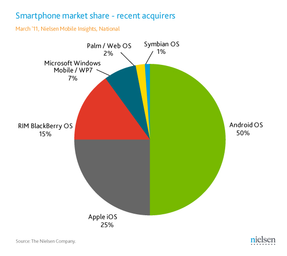
Smartphone Market Share Wars

Google's edge appears to be growing, for the moment at least. Among recent acquirers, it is toasting just about everyone else:


These data confirm why Motorola Mobility (MMI) reported a solid first quarter while Research in Motion (RIMM) reported a positively dreadful quarter. Incidentally, the trends in both stocks going into their earnings releases were indicative of exactly the opposite of what was reported. RIMM had been having a small rally while MMI had been slumping into its release. So much for the market always predicting these things correctly.

On a larger point, it is very difficult to see how RIMM recovers from its rapidly shrinking share. Both Android and iOS have been making headway in being adopted by enterprise customers, which are RIMM's last bastion. To put it mildly, I wouldn't be astonished if RIMM is struggling for survival in another five years. 

These data are not too bearish for Apple (AAPL) at the moment because 25% of a growing pie is not all that bad, though this isn't as bullish for them as it once was. Still, this share relatively to where they had been is a much better position than RIMM, which once had something over 50% market share and now is only at 15% among new adopters.