Disclaimer

Opinions and observations expressed on this blog reflect the authors' individual experiences and should not be construed to be financial advice. None of the members of this blog are licensed financial advisors. Please consult your own licensed financial advisor if you wish to act on any recommendations here.

Friday, May 16, 2014

JCPenney Coming Back?

First, full disclosure here, I hold a modest position in January 2015 JCPenney (JCP) $10 call options as a small proposition bet that JCPenney would indeed at least recover enough for me to make some money. I'm a little more ambiguous on the idea that the company will totally recover from what it's been through.

With that out of the way, JCP rallied quite a bit today, jumping 16.25% to $9.73, its highest close since about November, on a favorable earnings report last night. Sales growth topped estimates and the losses were narrower. See this press release for the overview: http://www.marketwatch.com/story/jcpenney-reports-fiscal-2014-first-quarter-results-2014-05-15

Part of the reason same store sales growth was pretty solid at 6.2% was due to a pretty favorable comparison since in the first quarter of last year they were really in their down stroke phase and sales dropped by solid double digits. Add to that the fact that closing your weakest performing stores prunes the numbers to give some extra lift and you get a pretty decent number. I'll be awfully curious to see if this can be maintained going forward.

Importantly, gross margins have started firming up and the company apparently expects them to continue to grow. It also appears that they are beginning to move toward eliminating their longstanding hemorrhage of cash. This is important since one of the very legitimate concerns with JCP is that the company was swiftly moving toward Chapter 11. Those concerns are gone for now. Based on present information, it's not easy to see how that risk is still relevant.

I think that their result today shores up my conviction in my January 2015 $10 calls, but I'm not exactly hot and bothered to add to the position. There are still a great many difficulties there, including the possibility of share price dilution should the company need to recapitalize. It doesn't have the prettiest balance sheet in the world with a shareholder's equity position that has fallen from $5.46 billion in 2011 to just over $3 billion now. This is also just a much smaller company than it once was, with revenues dropping from $17.76 billion in 2011 to $11.86 billion in 2014. While they seem to have stabilized at the present level, it's quite unlikely that they'll be making any runs at their old all-time highs anytime soon. Just to give a sense of what has happened to it, have a look at this:

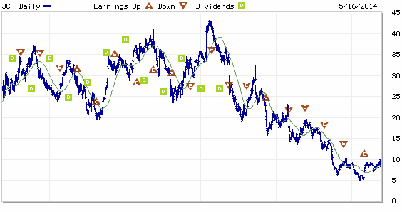
Chart courtesy of Marketwatch.com

Here are some stories by those that have spent more time than me on JCP, first those expressing caution:


On the more bullish side, we have these stories:


Of course, this is what makes a market. I'm a little cautious myself since the department store industry in general isn't a particularly great one at the moment, even if JCPenney is embracing an online presence very aggressively. Its glory days are, I think, in the past and we're just basically speculating that it got undervalued due to death-spiral concerns about its liquidity. If it can hang on and restore modest profitability, JCP makes sense for my position and for maybe some quick trades, but I'm skeptical regarding its long-term prospects.

Of course, I've been burned on clothing retailers before, so I'm prepared to be surprised again.

Wednesday, May 7, 2014

How long do you have to hold stocks to smoothe out all of the swings?

This is a question, or some variant thereof, I get quite a lot. We very often hear that you'll earn anywhere between 7-10% on stocks per year over the long term. This is true, but just how long are we talking here? If we do the stretch of 1928-2013, the historical compounded annual growth rate (CAGR) was around 9.2%.

The problem is that after an 85-year holding period you'll look something like this:


5 years isn't anywhere near enough and neither is 10 years. The answer is that you'll have to hold for 20 years or more to really guarantee that you'll get something in that range. Even the 20 year holding periods can swing a little bit above or below those long-term targets, but once you get out to 30 year or 40 year periods we're finally there. You get nice stable rates of return that don't vary much at all. Over those periods, stocks are basically as risky as going to the bathroom. See the chart below. The way to read this is that each line represents the annualized return of that holding period through that year. So, for 1968, the 40-year line represents the annualized return for the 40 years through 1968.


So, if you're thinking 10 years gets the job done and averages everything out, think again. You have to invest with a long time horizon if you want to truly wash out the wild swings.

Putting Riskier Assets Into Your Portfolio Stabilizes It?

Alright, that was a much longer hiatus than I would care to ever repeat and I decided to get back into the swing of things here by writing about one of my favorite little facts in portfolio theory. That is the peculiar fact that adding stocks to an all-bond portfolio actually stabilizes your returns and you get a higher return for less risk.

You know how economists always say there's no free lunch? Well, there's an exception to that rule and it comes from what is referred to as the "efficient frontier," which amounts to a rule about assessing the true relationship between risk and reward. Long story short, there isn't a straight linear relationship. There's a weird bend in the curve that makes a 27% stock portfolio as safe as a 0% stock, 100% bond portfolio and makes a 15% stock portfolio the least risky of all. For all of the charts below, I used data on total returns for stocks and 10-year U.S. from 1928 to 2013.


But wait, there's more! Because of the fact that adding stocks to a portfolio increases your long-term annual returns, this actually means that you can reduce your volatility and increase your returns in that backward-bending portion of the volatility curve. 


The idea that risk and reward are strictly linearly related has been a longstanding fallacy that most people buy into, but there are even every day exceptions to that. For example, you can walk into a street with cars going 25 mph and the odds are that they will stop and not run you over, even though they'll be incredibly angry with you for making them hit the brakes. However, they might not hit the brakes and then you'll be run over. The risk there is pretty high and the reward is saving a few seconds on your commute. 

The reason that it's not linear in the case of investments has to do with the fact that the factors which move stocks and bonds are different. Bonds typically do well in environments where investors are risk-averse and the outlook for inflation is declining, often because growth is declining. Stocks generally (surprise!) do well when growth prospects are strong. There are years where their interests coincide, very notably 1995 and 1982, because falling interest rates are good for bonds and stocks, all else being held constant. The consequence is a distribution of returns that looks something like this.


There's a smattering of about 8 years where they both do very well and you can see that in the upper-right corner, but otherwise there's a decently strong inverse relationship between the two.

So, the conclusion here is that by introducing a riskier asset class, in this case stocks, into a portfolio that starts as 100% bonds, you actually reduce your long-term volatility and increase your returns at the same time.

Now, a related question is what allocation avoids the worst performance historically. The answer isn't quite the same, but it's close. 


It works out that an 11% asset allocation to stocks has had the smallest 1-year decline of any asset allocation at just over a 7% drop. This of course prompted the question of what is the best year each asset allocation has seen. There's no question that 100% stocks will see the best year, but the rest of the curve is kind of interesting.


I know it's a little spooky, almost like Quantum Entanglement, but facts are facts and it's important to know what asset allocations are truly best for reducing volatility if that's your preference.

In case you're curious about the history of this idea, Harry Markowitz, one of the all-time greats in financial economics, was the one who really popularized it. 

With that, it's good to be back and I hope to be posting more in the future.

Thursday, January 5, 2012

What Do Jobless Claims Tell Us About Nonfarm Payrolls?

With a very strong ADP number this morning, some are wondering if tomorrow's jobs report could be a blockbuster.  There's a good chance it could be fairly decent given the recent trend in jobless claims.

Here's the relationship between the two since January 2004:


That there is a relationship between these two is not a surprise as they have a very strong intuitive link.  However, the relationship is clearly not consistent as there have been months where jobless claims average 500,000 a week and yet jobs changes were near the flat line. Similarly, we have had months with net job losses where jobless claims have averaged less than 400,000 a week for that month.  Coming off of the recession, it seems that we can generate net increases in jobs at relatively high levels of jobless claims. In the past month, jobless claims have averaged 375,600, the lowest May of 2008, which was actually a time when we lost over 200,000 jobs.  On the flipside, we had a month in February of 2011 when jobless claims averaged 392,500 and nonfarm payrolls grew 235,000.  Go figure.

The basic reason is that the change in nonfarm payrolls is the residual of the massive amounts of gross job gains and losses that occur each month.  Millions of jobs are created and eliminated every month.  Jobless claims are effectively a measurement of gross job losses.  As we enter recession, the offsetting gains diminish and thus we can lose fairly substantial amounts of jobs even at apparently benign levels of jobless claims.  The inverse is true as well.  The question is always "Which part of that slope are we on?".  At this time, we appear to be at a time with accelerating gross job gains that are allowing us to have substantial net job creation even close to the 400,000 level in jobless claims.  As such, it is quite likely that we actually will see net private sector job gains of over 220,000 in the report tomorrow.  Government losses will offset that amount to some extent, but overall it should be a decent report.

A Simple Discussion on Deductions and Exemptions

As someone who works in the tax policy field, I understand where the frustration comes from when people look at the massive schedules of deductions available to both individual taxpayers and businesses.  As such, since tax code simplification is a popular subject these days, some just throw up their hands and say, "Get rid of them all and tax every dollar of income!".  It's an emotionally appealing argument in times like this, but let's remember some theoretical bases behind why we set up the tax code the way we did.

First, I would like to remind people of how businesses are taxed in this country.  Except in a few states where either gross receipts taxes or some form of value added tax exist, businesses are taxed on their net income.  Net income is a defined term that doesn't correlate with cash flow, except in some cases by accident.  For tax purposes, it is the business' gross receipts - deductions for various expenses or bonus deductions for certain activities.  As a general rule, though, the idea is to impose a tax on what is available to the business after it has paid for all of its normal operations.  Businesses not keeping their heads above water don't play taxes.

The same principal is applied in a different way to individuals.  Individuals do not have a "net income" as we commonly understand it.  Individuals have a great deal of latitude in how to incur expenses and pretty much anyone can expand their expenses to fit any income.  However, there are certain minimums that people can't go below and this is the basis of the baseline deductions and exemptions.  A certain amount of income will not be subject to tax in order to allow individuals to pay for baseline expenses without having to pay taxes.  This is to avoid taxing beyond their ability to actually pay their bills.  The effect is to try to create a parallel to business net income for individuals and in so doing not taxing them beyond their ability to pay.

I would be the first to admit that we have far too many specialized deductions and credits that serve very particular interests or that have outlived their usefulness, but to simply rid the tax code of deductions and exemptions is not the answer.  It doesn't even make good theoretical sense.  The reason that more and more people are falling of the tax rolls is because the indexing of exemptions and deductions continues to push people with stagnant nominal incomes below zero taxable income. What this reflects is that the cost of living is accelerating faster than their ability to pay.  Simply deciding to redefine the boundaries of the tax system to have those people pay more in taxes doesn't seem to make logical sense.

Monday, December 19, 2011

Bank of Merrillwide

I sometimes forget that not only did Bank of America (BAC) buy Merrill Lynch, which was inexplicably on the verge of an utter meltdown in the fall of 2008, but that it also took own the absolutely toxic Countrywide Financial.  In recent months, it seems to have inherited the same sick death spiral that both of those constituent companies had in the months leading up to their demises.

The mystique of former Bank of America CEO Ken Lewis always baffled me.  Bank of America was rarely a stellar performer, even among the ordinarily demure commercial banking sector (at least it appeared demure prior to 2007).  He made some significant acquisitions of companies such as FleetBoston and MBNA, but to say that those purchases alone made him some financial services management genius would be a little bit of a stretch.  Like many of the CEOs in the commercial banking sector, I think that he envied the apparent success of the investment banks, especially Goldman Sachs (GS), during the mid-2000s.  Indeed, traditional banking business units were often looked at with a measure of disdain during those years since they had declining margins and simply weren't as attractive as hedge funds, private equity, and any number of other newer businesses.

Some banks, like Wachovia, Citigroup (C), and Bank of America bet recklessly on the housing bubble in order to attempt to get attractive rates of growth.  They paid the price for it.  Wachovia nearly died and had to be bought by Wells Fargo (WFC) while Citigroup and Bank of America had close calls.  In the midst of all of it, Ken Lewis thought he would be something between the shrewdest value investor in history and the savior of the financial system by buying up Countrywide Financial and Merrill Lynch when both were on the brink.  Had both not been so terribly flawed, he might have been onto something.  As it was, he created a great big lumbering, wounded giant.

Lewis was booted (well, not really, but you know how this all works), but the legacy of his misdeeds still haunts Bank of America to this day.  Over the past year, the stock has atrophied horribly and now has plunged to devastating lows of less than $5 a share:

While no particular news has come out other than the constant drumbeat of bad news out of Europe, the implicit news that the market seems to have priced into the share price is that Bank of America will have to issue more shares to increase its capital ratios.  After all, it supposedly trades at just 5.5x next year's earnings according to current analyst estimates.  Since the overall market is not utterly panicked at the moment, it stands to reason that there might be something to this expectation.

With headlines like this one swirling around, it might be dangerous to speculate on the unknown here: http://www.marketwatch.com/story/draft-big-bank-capital-rules-expected-soon-2011-12-19

I should caution that while Bank of America has one of the lowest prices you'll see in a major financial stock, it's hardly unique this year.  Look at Goldman Sachs:

The two declines are not qualitatively different.

Wednesday, November 23, 2011

Is there such a thing as an "average" year?

Since we're coming up on the end of the year, we'll no doubt hear about how the next year will be an "average" year.  Very nearly every year I've followed the markets, just about every market commentator, or at least two-thirds of them, have called for a "typical" year of stock market performance.  If it was a bad year in the prior year, they'll say "Things were tough and we're still coming back so I think it will be a slow, average year of recovery."  If it was a good year, "We saw some good things last year, so we'll probably be coming off that somewhat and go back to a more typical rate of return." Even if it was an average year, they would use that as the basis for forecasting an average year.

The reason for this is all very simple, which is that people have an immutable faith in the central tendency of a long-running time series.  The problem is that stock market returns don't follow anything close to a normal distribution (CLICK ON PICTURE FOR LARGER IMAGE):

First of all, I would like to point out that there is a big difference between the compounded annual growth rate (CAGR) and the "average".  This is because averages almost completely ignore the effect of significant down years.  To explain it in a clear example, if you drop 50% in the first year and rise 50% in the next year, the two year average is 0%, but you're actually down 25%.  The CAGR captures this, but the average does not.  As such, the long term typical rate of return is about 140-150 basis points lower, depending on how you draw your time horizon.  The difference is notable, by the way.  At 7.9% per year over 40 years, $1,000 turns into $20,932.  At 6.5% per year over 40 years, it's $12,416.  In other words, please don't base any projections you are doing for your retirement on the average rate of return.

By my count, there is only one year that was +1% or -1% from the long-term CAGR, which was 1993.  Hell, make that a 3% band and you still only get about 7 or 8 years, depending on how you round off trailing digits.


As you can see, this is not a normal distribution by any stretch of the imagination.  

As such, when you see the annual forecasts come out toward the end of this year, feel free to snicker when you see people project that we will see the long-term average rate of return. 

Sunday, November 6, 2011

On Economic Troglodytes

One of the things I see on more "populist" forms of financial news commentary is a grave mistrusting of seasonally adjusted data.  For the uninitiated, a seasonal adjustment is a filtering process for volatile data series that have a clear seasonal pattern.  By correcting for the observed historical seasonal patterns, you can get a smoothed look at what the data are without the typical chop.  Good examples of data with significant seasonal oscillations are housing starts (with far more in the spring and summer than in the winter) and employment (with massive amounts of layoffs right after the holiday season and robust hiring in the summer).

However, there is a group of people who don't trust seasonally adjusted data, largely because I don't think that they understand it.  Take this post from Minyanville.  The author boldly dismisses seasonally adjusted jobless claims data as not being "real" and asks that readers look at the non-seasonally adjusted data.  Then, there is a choice quote later:
The actual weekly initial claims data exhibits week to week patterns each year that are consistent, as certain industries tend to add and subtract workers at the same time each year. Rather than smoothing the data to obscure what really happened last week, we can compare the numbers directly with prior years' performance during the same weeks to get an accurate reading of the current trend. Like an optometrist, we can look at small changes and ask whether they are better, worse, or about the same as last year. By carefully evaluating subtle changes, we gain clarity of vision.
As it so happens, that is precisely what the seasonally adjusted data does, however imperfectly.  The reason that, beyond a simply seasonal adjustment, economists like to look at a 4-week moving average for jobless claims is that, even after going through the rigors of a seasonal adjustment, large one-time events can occur like a major corporate bankruptcy, a strike, or a major weather event.  By taking a simple average, you can somewhat smooth this out.  Doing so is, by definition, somewhat backward looking, but it is a tool that you can use if you so choose.  One thing I've learned in my line of work is that there is no one right way to analyze data.  The circumstances may call for a few different ways of looking at it.

What some of the troglodytes like to do is use a 12-month moving average or something like that instead of a seasonally adjusted number, claiming that actually represents the real data.  A neat little trick here is that the 12-month moving averages of the non-seasonally adjusted data and the seasonally adjusted data come out almost exactly the same, which is what you would expect if the seasonal adjustment is worth its salt.  See this below with housing starts data:


However, 12-month moving averages don't capture "real time" changes in the data.  It's for much the same reason that year over year comparisons are useless.  If you had a huge run up in the early months of the 12 month period, the leveled off and are now starting on a downward trend, you won't catch it in the moving average or the year over year numbers for another few months.  Look at the three measures of potentially judging what housing starts were doing during the housing boom and bust of the last decade (CLICK ON PICTURE FOR LARGER IMAGE)


The seasonally adjusted data catches the inflection point earlier and more decisively than either of the other two measures.  In the other two, you can eventually see it, but the seasonally adjusted data provides the much clearer signal.  This is because, with the seasonal filter, you can look at a current month and judge what it means on a "real time" basis rather than being dependent on backward looking measures that take months to provide a signal.  Also, compared to non-seasonally adjusted numbers, which at best rely on a year on year comparison, you can much more easily detect the trend.

This is why, even though seasonally adjusted numbers are not "real" numbers, they do provide the best picture of what is going on of all the data that get presented.  Frankly, people who reject seasonal adjustments as being some statistical creation are nothing but troglodytes.

Sunday, October 30, 2011

The CPI Food and Energy Debate

Occasionally I see something that annoys me so much that I feel the need to respond to it in a blog post.  Today, it was that I saw people on a message board saying that the Consumer Price Index (CPI) no longer includes food and energy so you shouldn't pay attention to it.  There are some legitimate criticisms of how CPI is calculated, but this isn't one of them.  The headline CPI number does include food and energy, but economists are usually more interested in the so-called "core" CPI rate, or the change in prices excluding food and energy.  The reason that they prefer this measure is that it isn't as driven by possibly arbitrary changes in commodity prices.  If inflation is truly endemic, it will show up in less volatile prices because wages are likely also inflating at a rapid rate, pushing up the prices of more stable goods as well as services.

Some have also wondered if over time the two come out more or less the same.  After all, according to some, inflation and food and energy is always faster than other prices so if you follow core inflation only you are missing the story.  Well, not really:


For most of the years after 1981, core CPI actually outpaced total CPI because energy and food prices were quite sedate while health care costs went through the roof.  Since the mid 1990s, however, it is true that total CPI has outpaced core inflation.  In fact, the compounded annual growth rate (CAGR) of total CPI vs core CPI has been 0.5% a year higher than core inflation since September 2000.  Still, what history would suggest is that these two will not diverge by a great deal for that long.

Now, as to the volatility, adding food and energy does add a great deal of volatility.  The average monthly inflation rate of both measures over the past 54 years is about 0.32%, but the standard deviation for the total CPI is a full 0.06% higher than for the core CPI.  It might not sound like a lot, but it does matter.

So no, there isn't some evil conspiracy behind excluding food and energy.  In truth, I look at both anyway as alternative measurements.  It doesn't take too long and there isn't much harm in doing it.

The European Debt Crisis: Was the Rescue Package Enough?

The stock market's initial reaction appears to offer the answer of "yes", but then again we saw fairly convincing rallies early on in the financial crisis in 2007 (as I always like to remind people, our problems began in the summer of 2007, not 2008).  Equity markets often give false signals, perhaps more frequently than other markets.

As of right now, it does not appear that European debt markets are buying into the program here.  For instance, we have not seen Italian bond yields gap down:

The same troubling thing holds true in Portugal:


There rates are down a touch, but still nothing noticeable, considering that they are trading close to 1,000 basis points above German 10-year bonds.

The issue, as I see it, is a similar one to what we went through in 2009.  Let's back up for a moment here and state clearly why sovereign debt defaults are important to us: they threaten the health of major banks.  That's the whole reason that even more stable countries live in mortal fear of a Greece or a Portugal going under.  Banks like buying sovereign debt for their reserves due to its low default rate.  If the debt they buy becomes distressed so they have to mark it down or if the borrowers default, that undermines the banks' capitalization and they need to, at best, issue more shares to recapitalize, which dilutes the value of existing shareholders.  In a worst case scenario, the whole rotten thing comes crashing down and the banks fail catastrophically.  I think that we all know the consequences that stem from that scenario.

As such, just like the situation we faced in early 2009, this is about whether the banks can reasonably attain enough capital to recapitalize to offset massive losses coming down the pike.  In our case, it was the continuing doubts over the mountains of bad mortgages that banks were carrying on their books above the likely value that they could realize those assets at.  Investors speculated for weeks and months about just what kind of hits our banks would have to take and it caused our markets to go into a total tailspin that took the Dow down to 6,500 at one point.  Just an aside, there is no rational model by which one can call that a fair price for the market at that point.  What came along to really solve the issue were the stress tests of our banks that detailed the amounts our banks needed to raise in additional capital in order to survive two differing economic scenarios.  While there was criticism over the rigor of the tests at the time, it really did prove to be a turning point, along with expansionary monetary and fiscal policy that had begun just before that.  They put a number on how much the banks would have to raise and investors could use that figure to pivot their decision making on whether or not to buy shares.  Before that point, it had been somewhat of an unknown.

The markets had already begun a recovery before the release of the test results in May 2009 (the bottom was March 9th), including a massive rally in bank shares, but as the year went on, the financial stocks eventually added another huge leg to their rally in the summer as the recapitalizations went along without much incident.  From then on in, the markets regained confidence, and things began to return to some level of normalcy.  There were many other measures taken, so I don't want to exaggerate the importance of the stress tests, but the point is that once the health of the banks was assured, the markets and the economy at large could move on.

The key to Europe is whether the banks will now be sufficiently recapitalized.  The stress tests there have been of questionable credibility, often only focusing on macroeconomic conditions and not pricing in what would happen with large write-downs of sovereign debt.  That has started to change in the most recent iterations, but some analysts think that the stress tests are low-balling the needed capital by as much as $200 billion.  As long as investors are not convinced that the banks' balance sheets are now as secure as the Maginot Line... wait a moment... as unsinkable as the Titanic... as solid as the walls of Constantinople... erm, well, pretty safe, we will be prone to a renewed crisis.

Of course, history may well show that this was the turning point and many of the naysayers have been wrong. After all, credit spreads here did not really start coming in until a full month after the stock market bottomed in March of 2009.  (CLICK ON IMAGE FOR LARGER PICTURE)


Spreads did not begin their true downward trajectory until early to mid April and did not actually reach quasi-normal levels until October.  In other words, it could be a while before we really know.  At this moment, I am doubtful that we have seen the last of this crisis.