I must confess some ignorance on the exact nature of the stress tests being conducted in Europe. When we conducted ours, the criteria were laid out in a fairly robust and comprehensive manner. Everyone could see what assumptions were being used and, though many scoffed at the scenarios as being too rosy, it would appear that there was some measure of success.
From what I have read, such as this post from Naked Capitalism, the tests do not include possible losses that the banks would incur from sovereign debt defaults. In other words, say the fictional Bismarck Financial had $50 billion in equity, but $75 billion in holdings of sovereign debt from Greece, Portugal, and Spain, they would be wiped out in a rolling series of debt defaults. However, under the stress tests (as I understand them), these exposures would be excluded. That would have been similar to if in our own stress tests we had excluded the possibility of further house price declines and rising mortgage defaults. As it turned out, the estimates for house price declines in our own stress tests were actually much more pessimistic than what panned out.
This brings me to a point here for those looking at Europe right now. Our own stress tests, despite being widely mocked by the more pessimistic analysts and observers, actually did a good job of quantifying the unquantifiable. The most dangerous aspect of early 2009 was that no one knew the exposure the banks were facing and financial markets froze under the uncertainty. It was nearly impossible to raise capital to replenish the equity positions of these companies. The stress tests provided a benchmark from which investors could use differing assumptions on whether or not a bank could be saved and decide then whether to supply it with more capital. As it turned out, as I recall anyway, not one of the major banks tested has since failed or had to be swallowed up by another in an emergency basis in the way that National City and Wachovia were in late 2008.
This was all possible because the standards being used were transparent and they were actually fairly sensible. I liken it to if a company forecasts that based on 4% GDP growth they expect to earn $4.50 a share. You can say that's nonsense and you think the economy will only grow 1% so they will earn less, but it's all out in the open and the market can decide, based on good information, what price capital can be raised at. From this perspective, the European stress tests do no seem adequate and I think it would be wrong to apply the relative success of our own experience to Europe.
Tuesday, June 29, 2010
What does a 2.95% yield on the 10-year mean?
Back before the world blew up in 2008, if ten-year treasury rates were much below 4%, I would say that you were either in a recession or a financial panic. Below 3%, I would have said that things must be pretty nasty right now. Well, I would say that the confluence of bad news out of Europe, China, and our own markets does indicate that conditions are fairly rough, but I think the more important signal is that there is absolutely not a chance of a major inflation outbreak. Indeed, 2.95% on the ten year indicates that we are either at 0% inflation or even have a mild case of deflation about to set in.
In either case, this is highly unusual and bears watching. My own suspicion is that investors are ridiculously risk averse, but the extent of the rally in bonds now has taken on a different life. It's hard to say for certain what such low yields portend.
In either case, this is highly unusual and bears watching. My own suspicion is that investors are ridiculously risk averse, but the extent of the rally in bonds now has taken on a different life. It's hard to say for certain what such low yields portend.
Sunday, June 27, 2010
What can video game console sales tell us about the perils of linear extrapolation?
I enjoy when I can combine more than one great love. For me, as a kid born in 1986, video games have been a major part of my life, so much so that I would say I love them. Also, growing up during the 1990s I got bitten by the stock market bug. Those are two loves. Another love is criticizing bad quantitative analysis. Today is my lucky day because I can talk about all three at once. I feel like George Costanza in Seinfeld when he discovered how to combine sex and food.
One of the greatest follies in quantitative analysis is the great temptation to employ linear extrapolation and rely on the observed "trend". Indeed, this is probably one of the single greatest follies of modern man. Now, in fairness, this seems to work most of the time. There seems to be a deterministic motion to the movement of most things over any given length of time. However, what about when that trend breaks? What if it breaks badly? Not sure what I'm talking about? Well, let's talk about video games. Before you lampoon me, let me first say that video games are big big business. While it is off its highs, Nintendo (NTDOY) was, at one point, worth nearly $100 billion a few years ago during the peak sales of the Wii. That's just Nintendo too.
Speaking of Nintendo, prior to the release of the Wii, you might be forgiven for assuming that Shigeru Miyamoto's proud gaming empire had seen its best days and was in a Sega-like death spiral. Indeed, look at this chart as of the end of the last generation of consoles:
 My word that isn't a pretty picture. Also, this is with the backdrop of increasing industry-wide console sales so Nintendo was absolutely hemorrhaging market share. I'm sure many marketing degree-bearing "analysts" at the time would have told me that Nintendo had so narrowed its brand focus to the under 16 crowd that this death spiral was intractable. Something something customer base something something brand confusion something blah blah synergy something. Why, the pretty red trend line that Excel drew said so. Many analysts did say just that very thing and suggested that, with the unwavering dominance of the Playstation 2, Nintendo might be relegated to only the handheld market.
Well, let's update this picture with generation-to-date Wii sales.
 My... I broke the trend line. I had to torture the damn thing to make it fit this one. Now, to be similarly idiotic I would say "Golly, if you just take that line and extrapolate it forward.... Nintendo will sell 200,000,000 consoles in its next generation!" That would be, unless Sony and Microsoft produce absolutely nothing, a bunch of crap. However, it is quite likely that Nintendo will breach 100 million units in this generation, which is a four-fold increase from the Gamecube.

One of the greatest follies in quantitative analysis is the great temptation to employ linear extrapolation and rely on the observed "trend". Indeed, this is probably one of the single greatest follies of modern man. Now, in fairness, this seems to work most of the time. There seems to be a deterministic motion to the movement of most things over any given length of time. However, what about when that trend breaks? What if it breaks badly? Not sure what I'm talking about? Well, let's talk about video games. Before you lampoon me, let me first say that video games are big big business. While it is off its highs, Nintendo (NTDOY) was, at one point, worth nearly $100 billion a few years ago during the peak sales of the Wii. That's just Nintendo too.
Speaking of Nintendo, prior to the release of the Wii, you might be forgiven for assuming that Shigeru Miyamoto's proud gaming empire had seen its best days and was in a Sega-like death spiral. Indeed, look at this chart as of the end of the last generation of consoles:

Well, let's update this picture with generation-to-date Wii sales.

Now, how might this have impacted your investment decisions? Well, let's compare Nintendo to Sony (SNE) from the start of the ramp up to the 7th generation consoles through the 2007 Christmas season, which marked the height of 7th generation sales.

Sony, to use a technical term, got its ass handed to it. Granted there are other problems at Sony including its terribly unprofitable film business and, more importantly, its ailing market share in televisions and portable music players. However, plunging from 75% market share in video game consoles to maybe 20%-25% hurt badly as well. That was a profit center for the company and they lost it.
Friends of mine can attest that I called Nintendo as the 7th generation winner long before the sales figures started coming in. Why did I do such a thing? Because I knew how kids bought video games and they couldn't pay $500 or $600 for a Playstation 3. Wall Street analysts didn't realize this either because they spoil their kids too much to know that those sorts of prices are well outside a family's birthday or Christmas budget. The Wii, at $250, was right in line for a combined present for the kids, or, for slightly more well off families, for a single kid. The fact that it was $100 less than the XBox 360 also helped. Granted, the "gimmick" of motion sensing controllers helped as well, but price was the key determinant. The proof? As Sony and Microsoft lowered their prices, the relative sales disparity improved. However, Nintendo got the upper hand and has not surrendered its edge. Frankly, it isn't likely to in this generation. Probably 2/3s of all the systems that will be sold in this generation already have been if not more, meaning that Nintendo would almost have to get skunked in order to lose its lead.
Long story short, this is to caution against bad analysis. I see it far too often in industry analyses and it leads to a lot of lost money. This is the simplest quantitative method people use and it is also the worst. As I said, it can be right a lot of the time, but when it is wrong, it is very wrong. When doing your analysis, consider a bigger picture than what an Excel trend line shows you.
Saturday, June 26, 2010
A good source for tracking changes in earnings estimates
Earnings estimates for companies change just about all of the time, at least for large, widely held companies. It's often hard to get a good sense of how these estimates are changing. One good source to track these changes on a daily basis is on NASDAQ.com. You can see what estimates have changed for the current quarter, the next quarter, current fiscal year, and next fiscal year.
If you need to get a sense of how the direction of estimates has been changing in recent quarters, I know that a lot of brokerage sites have analysis tools that help you do that. Alternatively, there are sites like Yahoo! Finance that show very much the same thing.
Now, what is the usefulness of analyst estimates? That's an entirely different matter.
Wednesday, June 23, 2010
A Housing Relapse?
There's a fairly good post over at Calculated Risk about the uptick in inventories shown in recent home sales reports. Additionally, as I have mentioned in the weekly economic updates, the temporary boost that the plethora of government programs has provided to the housing market appears to be giving way with some new price declines possibly setting in.
I would say, as does Bill McBride at Calculated Risk, that a new series of price declines would not be as catastrophic as they were previously. However, they will have a deleterious effect on economic activity and possibly make banks more unwilling to lend. Will it be enough to entirely derail recovery? I don't believe so, but it certainly bears watching.
Further, there is the possibility of synchronized declines with other major markets around the world such as Australia, which appears badly overvalued, and China, as has been previously mentioned. Australia is not a large enough housing market to sink the world, but when the bubble there starts bursting, it will cause some pressure that, if it occurs at the wrong time, could make life difficult.
Anyway, those are just my two-cents.
Monday, June 21, 2010
Economic Data Summary: Week Ended June 18th, 2010
This was a decidedly mixed week of economic data. Industrial production was quite strong, but housing starts and the Philly Fed were fairly weak.
May Industrial Production
This was the highlight of the week. 1.2% on the headline number, 0.9% on manufacturing, 1.3% on business equipment, construction equipment up 0.8%, and so on. There was not a weak component in the entire report except for mining, which is always quite volatile. Just to make the point about the strength of the recovery in manufacturing, here is a comparison of the past three recessions:
 There is a V-shaped recovery, but it is only in manufacturing. Still, I consider industrial production one of the very best coincident indicators so this is an encouraging sight.
May Housing Starts and Building Permits
If everything about industrial production was good, everything about housing starts was bad. Starts were down 10.0% and permits were down by 5.9%, indicating future weakness in starts. Weakness was widespread and should be expected to continue going forward as the distorting effects of the tax credit wane. I expect there to be many mixed signals in the next few months on housing and don't expect there to be a definitive up-trend until either the end of the year or well into next year. A potential full on relapse in housing with prices and sales falling on a sustained basis is not out of the question, though the magnitudes would be much less if for no other reason that there is not much room on the downside.
May Industrial Production
This was the highlight of the week. 1.2% on the headline number, 0.9% on manufacturing, 1.3% on business equipment, construction equipment up 0.8%, and so on. There was not a weak component in the entire report except for mining, which is always quite volatile. Just to make the point about the strength of the recovery in manufacturing, here is a comparison of the past three recessions:

May Housing Starts and Building Permits
If everything about industrial production was good, everything about housing starts was bad. Starts were down 10.0% and permits were down by 5.9%, indicating future weakness in starts. Weakness was widespread and should be expected to continue going forward as the distorting effects of the tax credit wane. I expect there to be many mixed signals in the next few months on housing and don't expect there to be a definitive up-trend until either the end of the year or well into next year. A potential full on relapse in housing with prices and sales falling on a sustained basis is not out of the question, though the magnitudes would be much less if for no other reason that there is not much room on the downside.
Sunday, June 20, 2010
Currency Risk: How exactly does it work?
This issue has come up about 1,200 times in the last five years for me, so I suppose it warrants at a minimum a brief discussion. Ideally, I should like to give it a little more justice than this, but once you go down this road, it can be endless unless you cut it off at a certain point.
Without discussing the finer points of how changes in foreign exchange rates impact your investments, let's use a simple example. In this fictional example, you buy 100 shares of Petrobras (PBR) in Brazil at $35 a share. The Brazilian currency, the real, is trading at 2.00 to the dollar. Whether you bought it on the Sao Paulo exchange or as a New York listed ADR (American Depository Receipt), it is still effectively denominated in the real. So long as the real remains at 2.00 to the dollar, changes in the underlying price of Petrobras should still have a 1-1 translation in dollar terms. In other words, if Petrobras rises by $1 in Sao Paulo, you shares, either there or here, should rise by that same $1 (or 2 reals). There is some break in the link with ADRs from time to time, but over the long run they correlate pretty well. ADRs are supposed to incorporate changes in foreign exchange rates in their valuations, but some times things go slightly awry.
However, what happens if the Brazilian central bank cuts interest rates, making in the interest rate differential between the U.S. and Brazil look less attractive so investors start selling real denominated assets? Well, here you can get a double whammy. Because there is a general flight from Brazilian assets, Petrobras may decline from $35 to $30. In other words, your asset fell from $3,500 to $3,000 or from 7,000 to 6,000 in real terms. However, the liquidation of Brazilian assets put pressure on the real too. Let's say the real weakens from 2.00 to 2.25 to the dollar.What does this do to your assets now? Well, they're still worth the 6,000 in real terms, but in dollar terms they are worth 6,000/2.25 or $2,667 (rounded). You lost $500 on the actual decline and $333 on the decline in the currency.
While this seems like a stylized example, it really actually isn't. Moves of greater magnitudes than this happened in Brazilian assets for much the same reason in mid-2006 because of nearly the same cause(the Fed was raising rates while Brazil was cutting and the real routed for a brief period as a result). Currencies move for a variety of reasons, but interest rate differentials, or rather the prospect for changes in differentials, are one of the major short term reasons. Of course, in the long run, current account deficits, the relative attractiveness of all forms of investment, political stability, and so on are major contributors. Economists have their own views on the subject as well relating to interest rate parity, which actually has the opposite conclusions of what we often observe over the short term in the markets.
Whatever the possible causes, which we can all discuss later, these are the effects and they bear watching. If an investor is blind to moves in the foreign exchange markets while investing in foreign denominated assets, they can get burned. Of course, if you are a U.S. investor and the dollar seems set to weaken for years to come, overseas investments are more attractive that ever. You get the superior profit growth of emerging markets plus the weakening of the dollar which automatically raises the value of your foreign investments. Of course, if you bet wrong, then your returns get clipped.
Saturday, June 19, 2010
Will China End the Peg?
We'll see if this latest signal turns out to be anything. There are those that have been buying Chinese ADRs for months and even years on this proposition because as the dollar weakens, Yuan denominated assets rise in value automatically. On a related matter, I hope to write a short piece on exchange rates and their effects on investment decisions tomorrow.
Tuesday, June 15, 2010
The Peculiar Allure of Gold
Anyone who knows me knows that I have a pathological hatred of precious metals so take that into account when I delve into a brief discussion of gold. Let me first get something out of my system by saying that, in my view, metals should only be valued by their relative rarity and usefulness in industrial purposes. At an emotional level, to me, not much else makes sense, but I digress.
In any event, gold has been the investment of the last decade, unless of course you invested in overseas stock markets. Brazil from the lows of 2002 kicked the hell out of gold. "Kicking the hell out of" something is a technical investment term used to discuss relative performance. Yes, it is true that gold blew away stocks in a bad way in the 2000s. Its proponents point to a few attributes that gold has that explain this performance. These are, namely:
1. Gold is the ultimate inflation hedge. Your money will not lose value if it is invested in gold.
2. Gold is the ultimate crisis hedge. When people get scared, they buy gold.
3. Gold is the ultimate hedge against a falling dollar. When people lose faith in "fiat" money, they will turn to gold.
Proponents argue that these are all absolutely immutable laws of the market and that these relationships always hold. In fact, some argue that there is a strict mathematical relationship.
Of these arguments, only the third really holds any water for me, and even that I am slightly skeptical of. Let me address these in order.
More after the page break.
Sunday, June 13, 2010
Economic Data Summary: Week Ending June 11th, 2010
This was a pretty pathetic week for economic data. There was really only one report of note and that was the monthly retail sales report. That was a fairly anemic report, but I wouldn't be too concerned about it just yet.
May Retail Sales
The headline was weak at -1.2% month to month, ex-auto was weak at -1.1% and ex-auto ex-gasoline was weak at -0.8%. It was a tough month all the way around. Not much more can be said than that. However, this is a volatile series and it actually has had a fairly decent run of late. A quick look at the chart below tells the story:
 While we are still not at the pre-recession highs, retail sales have been coming back fairly strongly, albeit from highly depressed levels. If the May weakness spills over into June, I will get pretty concerned, however. I don't suspect that it will from what I have seen elsewhere, but keep your eyes peeled.
April International Trade
The data here suggested some weakness in exports and imports in April, but it is hard to glean much from that tidbit of information. The recovery in trade overall has been fairly strong and leaked Chinese export data suggests that it will continue to be. The widening trade deficit, though it is happening gradually and we are still well below pre-recession levels, suggests that global rebalancing has not occurred. The rapid decline of the euro will only worsen the return to previous global imbalances. In the long run, that will put some pressure back on the dollar, but don't look for that to happen just yet.
One thing I want to point out to some who have been concerned that we are at risk of having serious damage done by an export contraction due to impending disasters in Europe and possibly China is that our exports are a small portion of our overall GDP. On an annualized basis, they are about 12% of GDP. The idea that our economic recovery so far has been dependent on overseas demand is truly laughable. Of that chunk, much goes to Canada and Mexico. China ranks a fairly distant third on that list. The Eurozone overall is fairly important, but it would still take epic declines to derail us solely from an exports perspective. The financial contagion channel is far more important.
Others
Yep, it was a pretty slow week, so let's rip through the rest.
Weekly retail sales were actually pretty good once again. Put a couple more weeks like that together and June could be a decent recovery from May.
Jobless claims were stubborn at 456,000. We've not made significant progress on this front in some time. Ideally, we would start seeing numbers around 420,000 and then 400,000, but that has not happened yet. I would caution against believing that the stagnation at these levels is prelude to a surge in claims, though. There is little evidence that will happen.
Wholesale and Business Inventories showed continued improvement in both sales and inventory growth. The inventory to sales ratios are now at record lows and will probably continue the downward trend that they have been on for years. How low can the ratio get? That is truly difficult to say. Many sectors now have less than a month's inventory in stock. If there was ever a major shipping disruption, things could get ugly. The major inventory adjustments are all behind us for now, though.
May Retail Sales
The headline was weak at -1.2% month to month, ex-auto was weak at -1.1% and ex-auto ex-gasoline was weak at -0.8%. It was a tough month all the way around. Not much more can be said than that. However, this is a volatile series and it actually has had a fairly decent run of late. A quick look at the chart below tells the story:

April International Trade
The data here suggested some weakness in exports and imports in April, but it is hard to glean much from that tidbit of information. The recovery in trade overall has been fairly strong and leaked Chinese export data suggests that it will continue to be. The widening trade deficit, though it is happening gradually and we are still well below pre-recession levels, suggests that global rebalancing has not occurred. The rapid decline of the euro will only worsen the return to previous global imbalances. In the long run, that will put some pressure back on the dollar, but don't look for that to happen just yet.
One thing I want to point out to some who have been concerned that we are at risk of having serious damage done by an export contraction due to impending disasters in Europe and possibly China is that our exports are a small portion of our overall GDP. On an annualized basis, they are about 12% of GDP. The idea that our economic recovery so far has been dependent on overseas demand is truly laughable. Of that chunk, much goes to Canada and Mexico. China ranks a fairly distant third on that list. The Eurozone overall is fairly important, but it would still take epic declines to derail us solely from an exports perspective. The financial contagion channel is far more important.
Others
Yep, it was a pretty slow week, so let's rip through the rest.
Weekly retail sales were actually pretty good once again. Put a couple more weeks like that together and June could be a decent recovery from May.
Jobless claims were stubborn at 456,000. We've not made significant progress on this front in some time. Ideally, we would start seeing numbers around 420,000 and then 400,000, but that has not happened yet. I would caution against believing that the stagnation at these levels is prelude to a surge in claims, though. There is little evidence that will happen.
Wholesale and Business Inventories showed continued improvement in both sales and inventory growth. The inventory to sales ratios are now at record lows and will probably continue the downward trend that they have been on for years. How low can the ratio get? That is truly difficult to say. Many sectors now have less than a month's inventory in stock. If there was ever a major shipping disruption, things could get ugly. The major inventory adjustments are all behind us for now, though.
Saturday, June 12, 2010
The Last Days of Lehman Brothers (2009)
This will be a little off our usual topics, but as it is financial news related I felt I should post it here as well. I originally penned this for the other blog I contribute to, Audio/Visual Anthropology, but the subject matter of the production warrants a place here. If nothing else, it mixes things up a little around here.
---
Normally made-for-TV movies about recent events are full of overacting, simplistic dialog, one-dimensional characters, annoying narrators providing lousy framing devices, and occasional irritating music. The Last Days of Lehman Brothers (from here on TLDOLB) suffers from these typical shortcomings, but not to the extent that some of these endeavors do.
Before continuing, I must preface that I have an unusual interest in the subject matter. If you simply do not care about the financial crisis that was in its most frightening throes about 21 months ago, then there might be no reason to watch this very brief attempt to humanize the cryptic figures behind our financial system's most epic failure. If you are not familiar with the events, there is little to help you. Indeed, there are no explanations saying "This is Jamie Dimon, CEO of JP Morgan Chase". When they refer to some of these individuals by first names or last names, you are almost entirely unaware of who they are if you do not follow financial news. Nonetheless, I think that there would be some value in watching it even with no familiarity since this production does depict the weekend in September 2008 that has so profoundly shaped our current world. More importantly, it does so passably. As such, I feel it is worth the investment (excuse my word choice). After all, the run time is only 60 minutes. Unfortunately, the CNBC version is shorter and cuts out some scenes entirely.
The length is strangely enough a small advantage. Most of its ilk run around 100 minutes and often truly do not have that amount of material available so we are inundated with introductions to characters that we will not care about because the slapped together screenplay is too incompetent to make us care. TLDOLB waltzes somewhat into the opposite problem. It starts hot and heavy right in the midst of the maelstrom and often cuts through key moments without really explaining what is going on. Once again, if you followed the crisis there is some inside baseball you might, emphasize might, understand that terse references to other events.
Wednesday, June 9, 2010
When bad things happen to good stocks
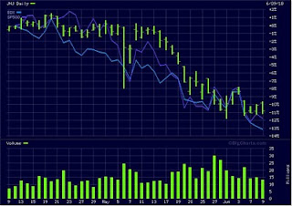
Why do bad things happen to good people? I can't really answer that one and frankly it isn't a very interesting question. Now, why do good stocks become slaughtered for no reason? That's a question that's worth asking.
Case in point Johnson and Johnson (JNJ) and Becton Dickinson (BDX). These are both good healthcare stocks with low multiples (compared to their historic norms) and good projected growth rates. They have also been utterly annihilated (relatively speaking) in the recent market sell-off. In fact, they are even being sold off as badly or worse than the broad market. Why? There really isn't a good rationale. The market is just very lousy at the moment:
 If you have been looking for some good core positions that you would like to be on sale, this isn't a bad place to look. Really bad markets such as this do have their good points. 2000-2002 and 2007-2009 had more than their fair share of these opportunities.
Case in point Johnson and Johnson (JNJ) and Becton Dickinson (BDX). These are both good healthcare stocks with low multiples (compared to their historic norms) and good projected growth rates. They have also been utterly annihilated (relatively speaking) in the recent market sell-off. In fact, they are even being sold off as badly or worse than the broad market. Why? There really isn't a good rationale. The market is just very lousy at the moment:

Tuesday, June 8, 2010
A Nervous Eye Toward the (Far) East
Technically Europe is a closer east than Asia is, but I will conform to the conventional parlance on this one. In any case, while the concerns around Europe are well known, I have been more closely tracking the troubling developments in the property markets in both mainland China as well as Hong Kong, and I don't like what I see.
From this Bloomberg article on Hong Kong:
"Home prices have risen 41 percent since the end of 2008, prompting the government to tighten down-payment requirements for luxury homes in October to curtail speculation after record- low interest rates fueled the surge. Financial Secretary John Tsang on May 12 pledged to keep boosting land supply."
Home prices up 41% in 16 months? That's worrisome to say the least. Considering that in the long run home prices are a function of incomes, I find that a little odd. I suspect that there are some at the upper ends of the income strata in Hong Kong that have seen even greater than 41% income growth and that is probably what is propelling prices higher at the margins. However, just as in California five years ago, the super rich are never enough to support a large real estate market (and despite being only one city, Hong Kong is a large market). Eventually, California reached a point where 88% of the population could not afford the median house. Yes, that is just as silly as it sounds. Hong Kong is at a similar juncture right now. Prices will have to correct, the question is when.
Saturday, June 5, 2010
Follow Up On Gulf-Related Oil Companies
Steve posed an worthy question that I think deserves to be followed up on in a big way. "Would other Gulf-operating organizations be affected long term or will the moratorium be lifted quickly enough that these other companies could take advantage of BP's now tarnished image?" This is a discussion that is very much worth having going forward and I would like to explore some of the possibilities.
 The companies listed here are Cameron International (CAM), Oceaneering International Inc (OII), Transocean (RIG), Diamond Offshore (DO), and Amerada Hess (HES). Of all of them, CAM and RIG are those most closely related to the particular event, though it appears that CAM has been weathering the storm comparatively well when you look at RIG. RIG, as the owner of the rig (how's that for a great stock symbol by the way), has direct liability issues with the spill just as BP does. CAM is also potentially liable as they actually made the equipment that was supposed to close the well-head and stop this from occurring in the first place.
Outside of BP, CAM, and RIG, the others might present some possibilities among the oil service companies. Of course, there are also BP's rivals such as ConocoPhillips (COP) and Chevron (CVX). The biggest risk to those two is easy to understand. If the Gulf is shuttered, less oil for them, and there will be greater capital expenditures on exploration and field development elsewhere in the future. If the Gulf is not completely shuttered, both COP and CVX look somewhat promising at this juncture.
Now, as for the variety of oil service companies mentioned here and also in this TheStreet.com article it is important to know exactly how these companies make their money, what their exposure to the Gulf is, etc. In terms of how they make their money, is it more reliant on new field development or is it more of a function of the output of current fields through contracts with the integrated oil companies? I have to confess, I am not too familiar with these arrangements. To boil down my previous knowledge on these companies to a simple statement: I knew they made money when oil went up and made less of it when oil went down. Circumstances such as this add complications and it is worth looking into it. I don't think that the market has priced many of these companies efficiently, particularly those with greater overseas exposure.
That being said, it is very important in this group that you know how the company makes its money. If it is more a function of global oil prices than new field development, that is worth noting. I simply am not familiar enough with them at this point to say which ones are good plays and which ones are not. I will take a stab at OII to see how reliant they are on the Gulf, what their contracts look like, and whatever else may be interesting. All of these companies have gotten slammed big time and there will be opportunities to be had. The question is where.
Economic Data Summary: Week Ending June 4th, 2010
Well, this week was quite a week for economic data. Strangely enough, it was quite solid outside of the employment report. As I will discuss in a moment, the employment report was not quite as bas as it looked either when you look at it from more of an economic perspective and less from a journalistic perspective.
May Employment Report
On the surface, this looked good. Just below the surface it looked awful. Into the core it actually looked alright. How is that all possible?
The headline number of 431,000 jobs looks good until you realize almost all of that was from the Census workers. Only 41,000 private payrolls. That's not particularly encouraging. This is a big relapse from March and April where we grew by an average of 183,000 a month in private payrolls. The 183,000 pace is not great, but it is much better than out of the prior two recessions. Still, it needs to be better and I suspect it will be as the year grinds on. Still, the diffusion indices indicated that most industries were hiring in May, though it had fallen back from April's very strong reading.
Now, the actually good parts of the report were found further into the bowels of data tables. Specifically I am talking about aggregate weekly hours for private industries. Here we saw the index tick up 0.4% after a 0.4% increase in April and a 0.5% increase in March. On an annualized basis, that is right north of 5% growth in aggregate weekly hours. Aggregate weekly payrolls, which is (hours*payroll employment*wages), increased a still better 0.6% after 0.8% in April and 0.3% in March.
For a comparison to the prior two recessions here is a graph:

This once again is the better measure than the headline payrolls number because it indicates the actual amount of labor demand in the economy as measured by hours. So long as this continues to increase, jobs will be created. Now, it is not bouncing back as quickly as it did from 1981-82, but on the other hand no one expected it to. This was a different kind of recession. It would have been nice if it was as simple as being caused by 21.5% interest rates to break inflation.
May Manufacturing ISM Survey
Friday, June 4, 2010
Weekend Reading: Bonds a Bubble?
There has been a fairly consistent refrain for two years or even longer that treasuries may indeed be overpriced, meaning that interest rates are consequently too low on long term instruments. This interesting article from MarketWatch hits on this idea yet again.
One thing worth considering is what it would mean if the long term treasury market actually did go bust. What are the implications for your investments? Unfortunately, this is not a pleasant prospect and it leads to one wondering where exactly their money should go. I actually don't have any particularly firm answers on this front, to be quite honest, but maybe by talking it through we can uncover some possibilities.
So, let's just say for a moment that for one reason or another, long term bond prices suddenly collapse. This could be because of worries about the solvency of the U.S., suddenly higher inflation expectations, or much more attractive investments elsewhere. The last two are more like than the first. Basically, if investors either need to abandon the safety of treasuries to beat inflation or if they feel that other markets offer stable enough returns that they can leave their fortress of U.S. treasuries, bonds will rout. How vulnerable are bond prices to changes in long term interest rates? Well, if rates on the 10-year rose from 3.30% to 5.00%, a $1,000 investment in treasuries would turn into $866.86. Ouch.
A Brief Musing On BP
I heard briefly from my uncle in Austin, an environmental engineer for nearly twenty years. He stated that he and his colleagues have extrapolated from the reports coming from BP that a great deal of information is not being shared. Most important of this information is that BP knows the scale of this disaster is far, far greater than the media is illustrating. It will not simply choke the Gulf ecosystem, nor be limited just to the Atlantic. The well is around three miles under the sea floor, and the flowing oil is eroding the walls of the well and its pace exiting into the sea is accelerating.
BP has given up plugging the leak, and it will be August at the earliest that relief wells are ready. That's two months of between 12,000 and 19,000 gallons per day, perhaps at a faster pace by August. With BP paying out to businesses affected by the spill, having already been billed once by the federal government for $69 million in cleanup costs and committing to covering the total cost of cleanup, which we now know will be an ocean-to-ocean-scale job, I think even a $36 stock price is asking just a bit too much.
Pile on a criminal investigation, public outrage, and some not-so-bright Republicans hoping to take advantage of an event that practically forces congress to introduce further regulations against drilling in the Gulf, and BP seems, for all their profitability, boned.
Do you guys agree? Would other Gulf-operating organizations be affected long term or will the moratorium be lifted quickly enough that these other companies could take advantage of BP's now tarnished image?
Thursday, June 3, 2010
Dynamic Asset Allocation Model: May Update
I will continue to provide monthly updates for the dynamic asset allocation model I outlined in an earlier post because the only real way to see what a model is made of is to test it in real time. Let's see what happened in May.
Using monthly closing numbers for the S&P 500, Ten Year Treasury, 90-day T-Bill, and Aaa 10-year Corporate Bond, the model suggests a continued heavy weighting toward equities at the maximum of 80%. Now, of course it suggested 80% before the bottom fell out of the market last month too, but the interest rate measures are largely designed to suggest the relative economic value of stocks and bonds and not to forecast crises.
Due to the fall in the S&P 500 and 10-year interest rates, the earnings yield measure improved noticeably. Corporate credit spreads widened, also putting upward pressure on the equity allocation. The one negative is that the yield curve noticeably flattened, virtually entirely a function of the fall in ten year interest rates. However, the overall composite score for the model on which the asset allocation is based reached one of its highest levels in the 1954-2010 period. In other words, if I let the model fluctuate up to 100% allocations in either stocks or bonds, it would be pretty damn close to 100%.
Frankly, this makes sense given where interest rates are right now. Bonds simply are not attractive relative to stocks at these interest rates given the recovery in corporate earnings. In the short run, as a crisis play, they have made sense, but remaining in treasuries for too long will wipe out those gains because 3.3% long term rates are not going to stay.
Take it or leave it. This is not professional investment advice, but this approach continues to suggest a high weighting toward stocks.
Wednesday, June 2, 2010
Embrace the Stability of... Toll Brothers???
This is not intended to be an endorsement of buying Toll Brothers (TOL) for your portfolio, but rather as a post demonstrating the utterly bizarre nature of the stock market at times.
In this instance, Toll Brothers, one of the companies most at the center of the housing boom as a luxury homebuilder, has proved to be one of the most stable stocks out there since the real estate crisis started in earnest in mid-2007. For most of the last 2 years and nine months, it has basically hugged relatively closely to where it started the period:

Compare this to many other companies so directly tied to the fall of the housing boom and you would be forgiven for thinking that Toll Brothers must be involved in something other than real estate. Of course, it did have a large fall between mid 2005 and mid 2007, which proved to be a solid leading indicator of the crisis. However, since then it has relatively consistently held up better than the broad market even as housing construction has imploded.
Just goes to show that simplistic analysis does not do one's investments justice.
Subscribe to:
Posts (Atom)